This summer our Cattaraugus-Allegany Board of Cooperative Education Services (BOCES) had the opportunity to host Jamie McKenzie at a multi-district staff development conference in southwestern New York State known as Curriculum Camp. During his time there, Jamie facilitated teachers through Module Makers 1 (link) and 2 (link) and led them to create some highly visual, highly motivating Slam Dunk Digital Lessons.

As the teachers were developing their lessons using Microsoft Word templates, the teachers became concerned with how to link the files, make them live, and publish them for student use. While the beauty of a Slam Dunk lesson is its simplicity with a lack of distracting animations, brassy color schemes, and potentially irritating sound effects, the step of linking six Word files through HTML is a complicated procedure and subtracts from the simplicity of the greater concept. Furthermore, because a Word document is designed to scroll while on-screen the temptation to insert images and text that are larger than the screen is always present.
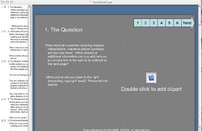
As Jamie's three-day stay proceeded, his statements concerning “PowerPointlessness” rolled around in my mind. I fully agree that PowerPoint can be a distraction from content, but started to imagine some of the benefits PowerPoint possesses when compared to Word. Perhaps the most beneficial benefit of PowerPoint is that a template can be created in which six slides are all in the same file. Within the template, a user can insert AutoShapes and create a virtual navigation bar by establishing hyperlinks from slide to slide. Because the lesson is embedded in a single file, portability and HTML conversion are no longer issues.
Aside from portability and the ease of displaying PowerPoint locally, there are several other advantages to using PowerPoint for creating Slam Dunk Digital Lessons. For one, the standard size of a PowerPoint slide is one full screen. This default size creates a boundary for content so module creators no longer have to be concerned with content being lost on a page due to scrolling. A navigation bar can be easily created so that pages can be accessed non-consecutively just as in Module Maker 2. Templates also provide set areas for page titles, images, and content text.
Other options in PowerPoint allow for a slideshow to be viewed in a window rather than taking up a full screen. By going to the menu and selecting Slide Show - Set Up Show - “Browsed by an individual (window)”, the module can appear in a window, and any hyperlinks can be viewed in an outside browser window. By clicking the option for the scroll bar not to be displayed, the size of the PowerPoint window can be adjusted and the slide will automatically stretch or shrink to fit the size of the window. This, again, eliminates the loss of content due to scrolling.
As Jamie left after his three-day stay, he gave us his stamp of approval for implementing a PowerPoint version of the Slam Dunk lessons. The template consists of six slides including a layout similar to his first Slam Dunk model shown at http://questioning.org/module2/quick.html with specific areas for text and images. It also maintains a navigation area so slides can be accessed non-consecutively.
As teachers used the PowerPoint version for Slam Dunk lesson creation, they commented that it was less complicated, took them less time, and was more visually pleasing. Although the new temptation of animation contamination, distracting sounds, and flashy color schemes is more accessible, the ease of access and use of PowerPoint created less distress for teachers who are looking to implement the use of a Slam Dunk Digital Lesson quickly.
To download the PPT template, click here. (Large file.)
To download and see an example created by workshop participants, Leon Mast and Lilly Milliman of Fillmore Central School, click here. (Large file.)
tim_clarke (AT) cabo.wnyric.org
 From Now On

